Triadic Color Scheme Examples for Flexible Packaging
Color is one of the first things consumers notice — long before they read your brand name or pick up your product. For flexible packaging, color isn’t decoration; it’s strategy. A well-built color palette guides the eye, reinforces brand identity, and helps your product command attention in a crowded aisle.
One of the most effective (and underused) approaches is the triadic color scheme — three colors spaced evenly around the color wheel. When used properly, it produces high energy, natural harmony, and professional contrast — exactly what modern packaging needs.
At Hawk Flex Packaging, we help brands apply color theory to real-world packaging. Here’s how the triadic system works — and how to make it shine across flexible films, pouches, and labels.
What Is a Triadic Color Scheme?
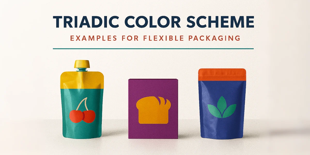
A triadic color scheme uses three hues evenly spaced around the color wheel. Classic examples include red–yellow–blue or green–orange–purple. This combination creates contrast without chaos, keeping designs vibrant but visually balanced.
Unlike monochromatic or analogous palettes, triadic schemes let each color have its moment. When used in packaging, that means bold accents, clear product hierarchy, and a design that pops without overwhelming the customer.
Why It Matters for Flexible Packaging
In flexible packaging, color interacts with more than just ink. Substrate texture, finish type, and film opacity all influence how a color looks in real life. Triadic schemes help maintain balance across these shifting variables by letting each tone play a defined role — dominant, secondary, or accent.
For example, a bright dominant color might fill the background, a cooler secondary shade supports typography, and a vibrant accent draws attention to your flavor, logo, or product callout. This approach gives structure to creativity — essential when printing on materials like PET, BOPP, or metallized film.
Triadic Color Scheme Examples
Here are some real-world ways triadic palettes elevate packaging:
- Snack Bags: Red (base), yellow (accent), and blue (highlight) — energetic, youthful, and easy to differentiate across SKUs.
- Pet Treats: A playful combination of green, orange, and purple delivers both contrast and warmth — ideal for brands using custom cat treat packaging.
- Tea Pouches: Soft gold, deep teal, and magenta add sophistication to wellness products. It’s a smart match for our custom tea packaging solutions, where visual calm and premium cues go hand in hand.
Following the 60-30-10 principle (60% dominant, 30% secondary, 10% accent) ensures your design stays harmonious even with strong color contrast.
Tips for Applying Triadic Palettes
- Start with Your Core Color: Use your brand’s main hue as the dominant tone and select the other two evenly around the wheel.
- Proof on Real Film: Ink colors can shift slightly on clear or metallized materials — always test on production-grade substrates.
- Balance Finish & Texture: Combine matte and gloss strategically to highlight secondary colors and enhance readability.
- Stay Consistent Across SKUs: Once your triadic pattern is defined, vary dominance or saturation for product differentiation while keeping the same three-color family.
When done right, triadic color schemes make even everyday products feel vibrant and memorable.
Hawk Flex Packaging: Where Color Meets Craft
Our design and pre-press team helps brands take color theory off the screen and onto real packaging. We work with film suppliers, ink specialists, and printers to ensure your triadic palette looks as bold on press as it does in concept.
We’ve supported brands across Oregon and nationwide, providing packaging solutions that merge art and engineering — from creative design assistance to full production runs. If you’re exploring new color strategies for your product line, reach out to our team. We’ll help translate your triadic color scheme into flexible packaging that captures attention, builds recognition, and looks stunning from every angle.
To explore how triadic color combinations balance vibrancy and contrast in design, try experimenting with the Adobe Color Wheel tool to see your palette in action.